Marston - Brand Identity Refresh
A Brand identity refresh including a logo, website and brief brochure to modernise and supply a simplistic yet effective approach to bind the brand within a new limited company.
Marston Property Maintenance | Brand Identity Refresh
Marston Property Maintenance (previously known as MPM Property) are a building specialist company who are expanding into a limited company with Dwell Property and Ash End. The aim for this project was to modernise their current logo and website whilst maintaining their loyal brand identity.

COLOUR SCHEME
Due to the old website server being down I am unable to retrieve visuals for the previous website and colour scheme which was pretty non existent with an 'anything goes' policy. The previous dark red and black mixed theme wasn't a truthworthy and professional theme so I decided to use bold, royal and corporate colours to both modernise and include professionalism to the identity whilst conveying the companies friendly attitudes.
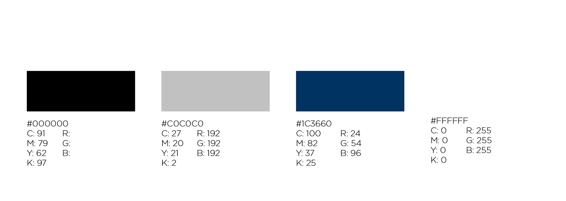
COLOUR PALETTE
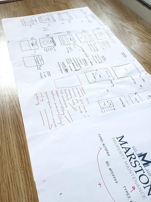
LOGO IDEAS | THE CONCEPT
The concept was to have a clear recognition for the company through it's new visual outcome, keeping the M from the previous design and supplying a simplistic approach using a descriptive logomark. The idea was to be able to supply a versatile logo where, if needed for other deliverables such as brochues, leaflets and email signatures, the logo could be stripped down and simplified yet still completely recognisable to it's consumer.
ORIGINAL LOGO

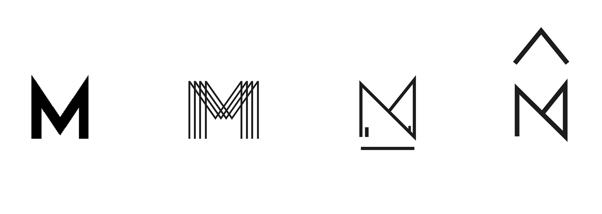
INITIAL LOGOMARK SYMBOLS
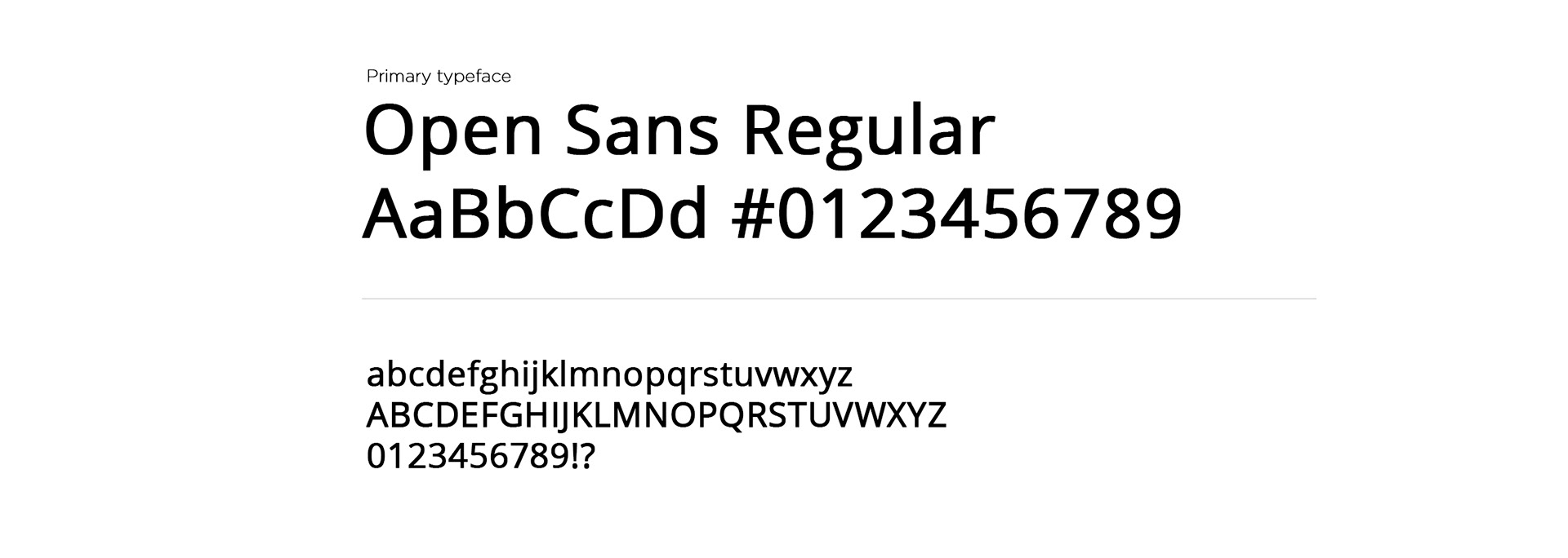
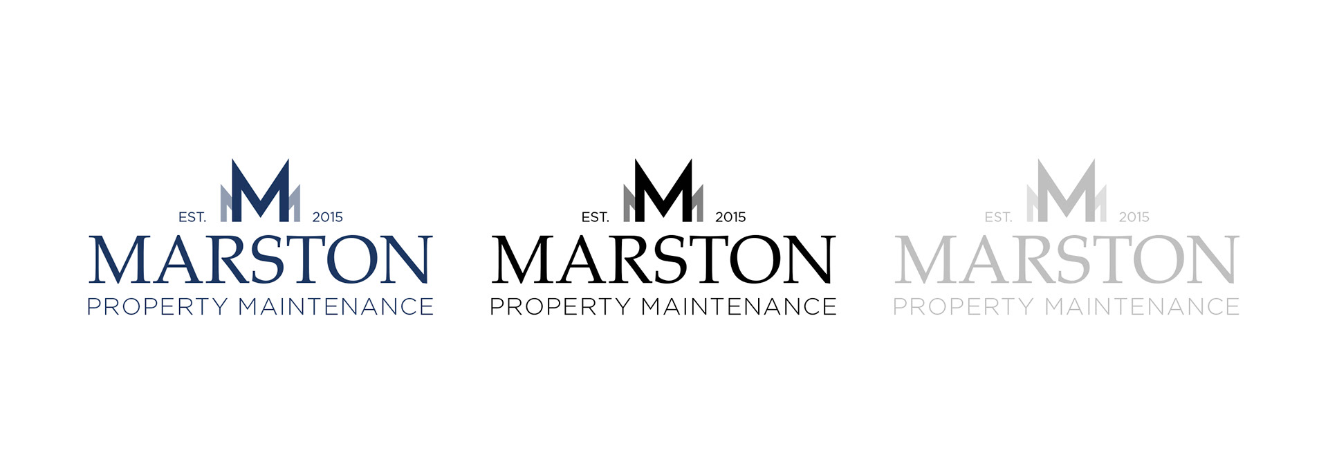
TYPOGRAPHIC SOLUTION
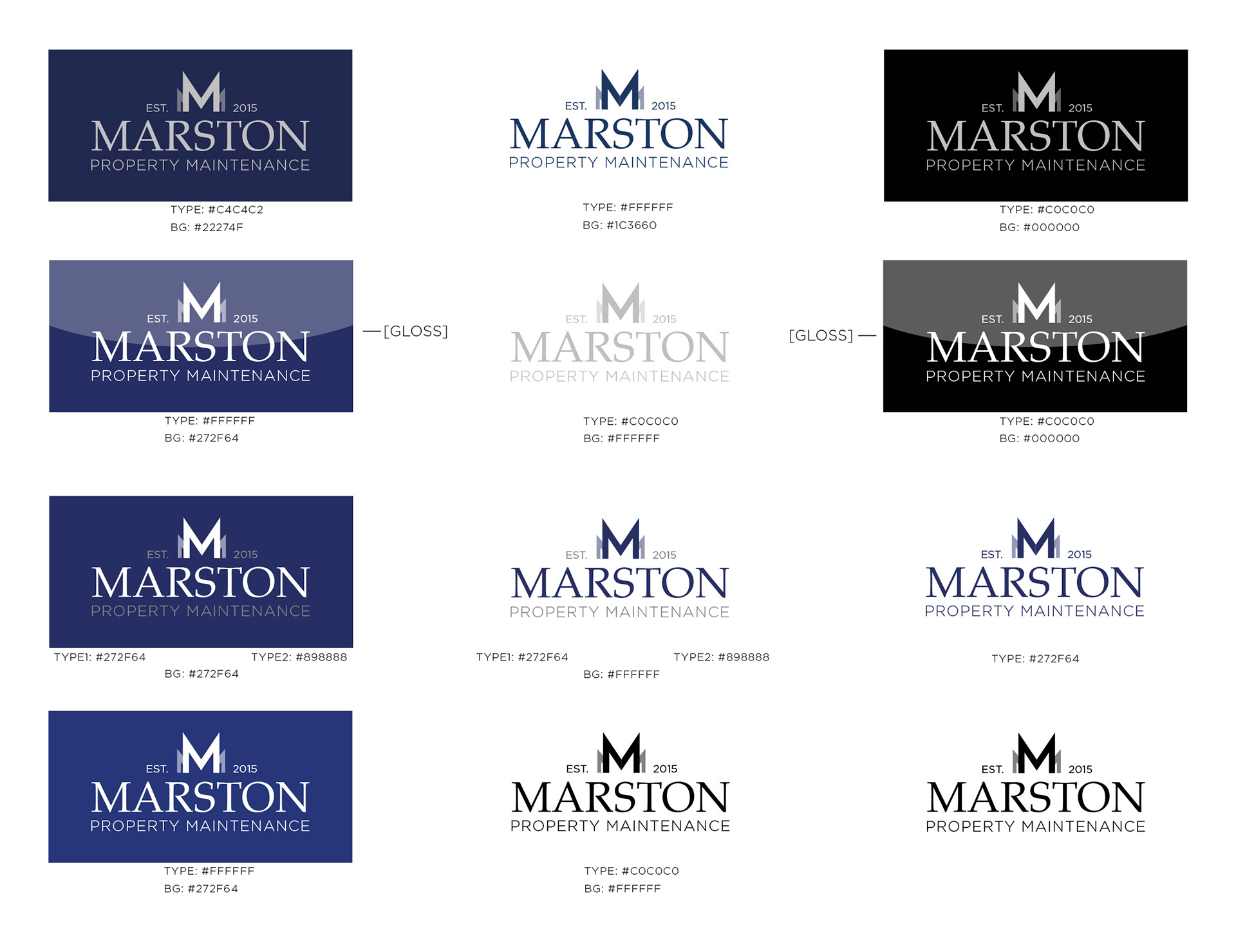
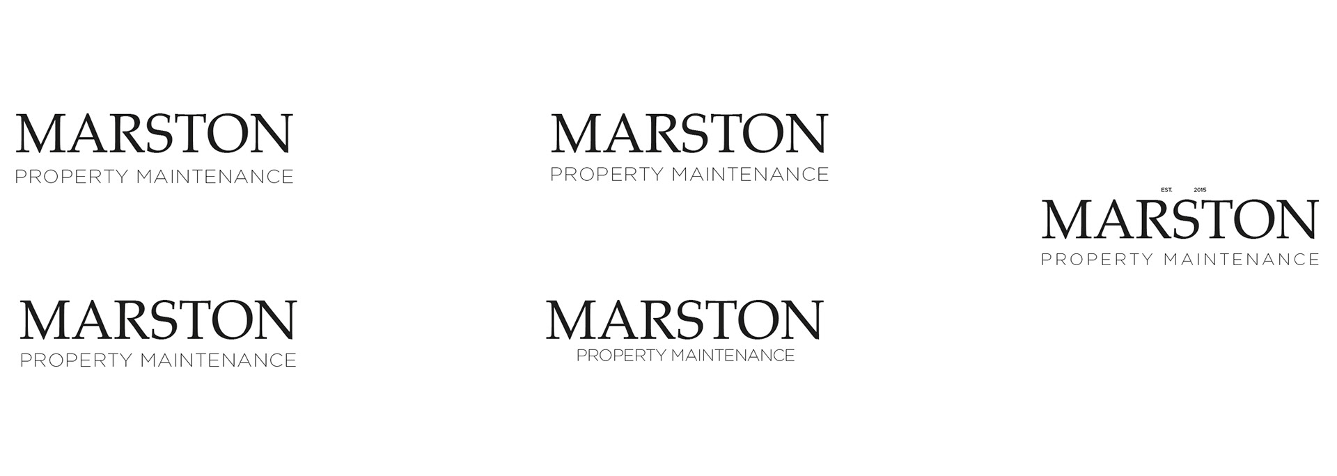
VARIATIONS EXPLORATION
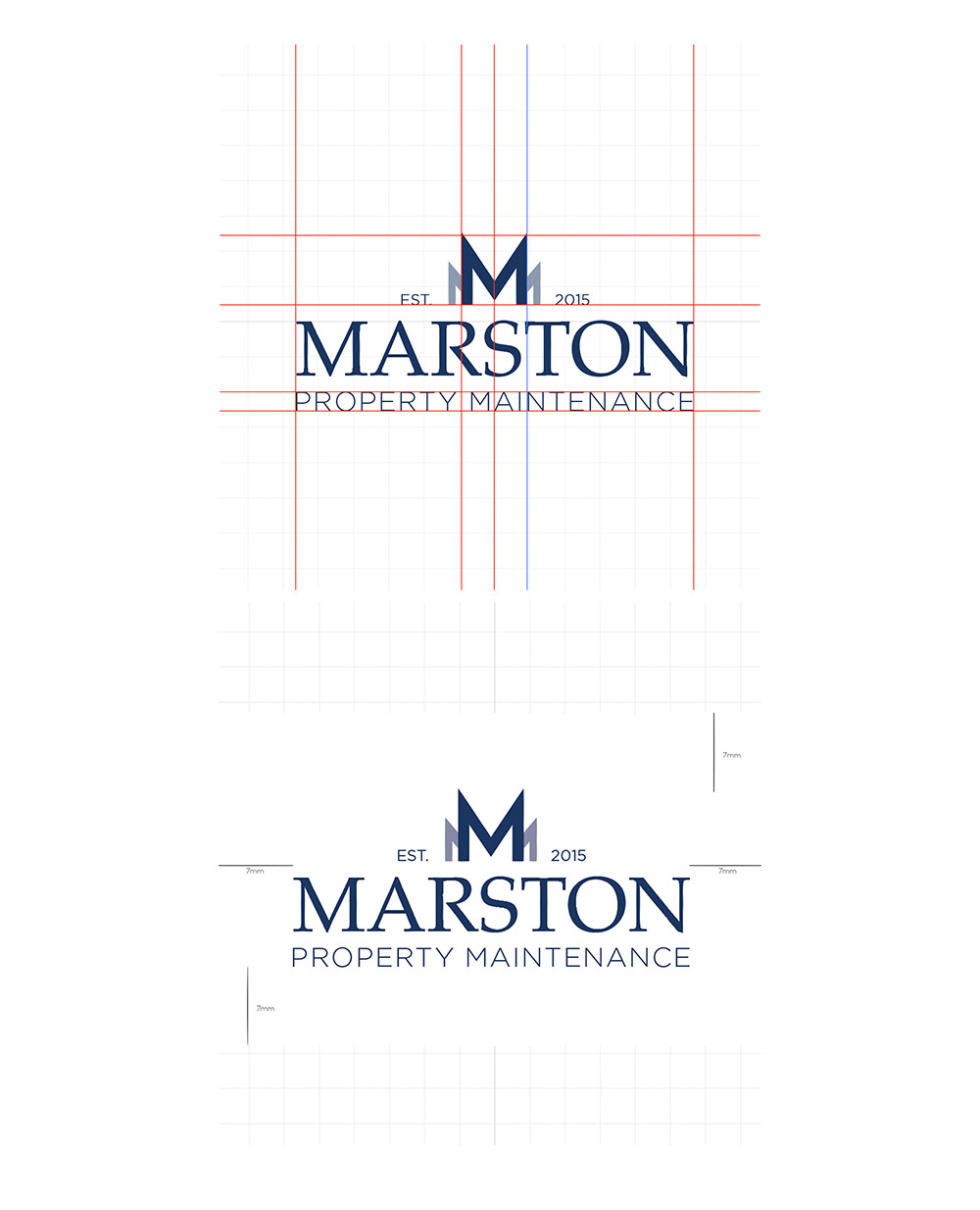
LOGO CONCEPT | GRID
The grid was applied to the logo to balance the logomark within multiple deliverables and outcomes. Having a center aligned logo provides numerous formats in design and keeps it simple but professional for sign printing. The square background variation is given an even 7mm on both X and Y axis to balance and keep the logomark centered.
FINALISED SOLUTIONS
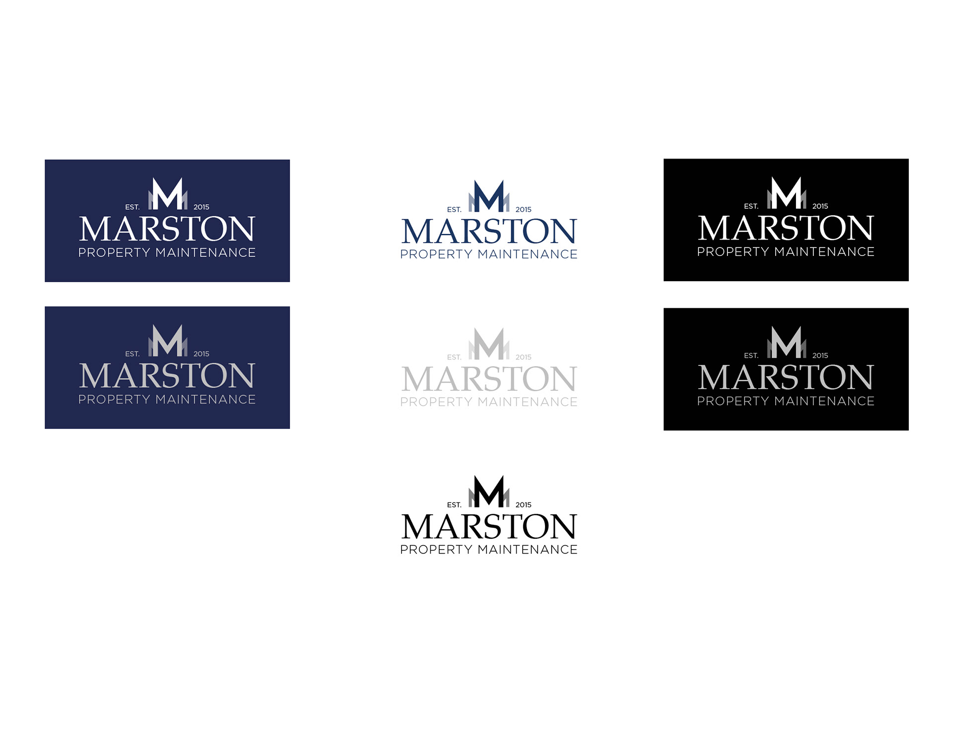
FINALISED VARIATIONS
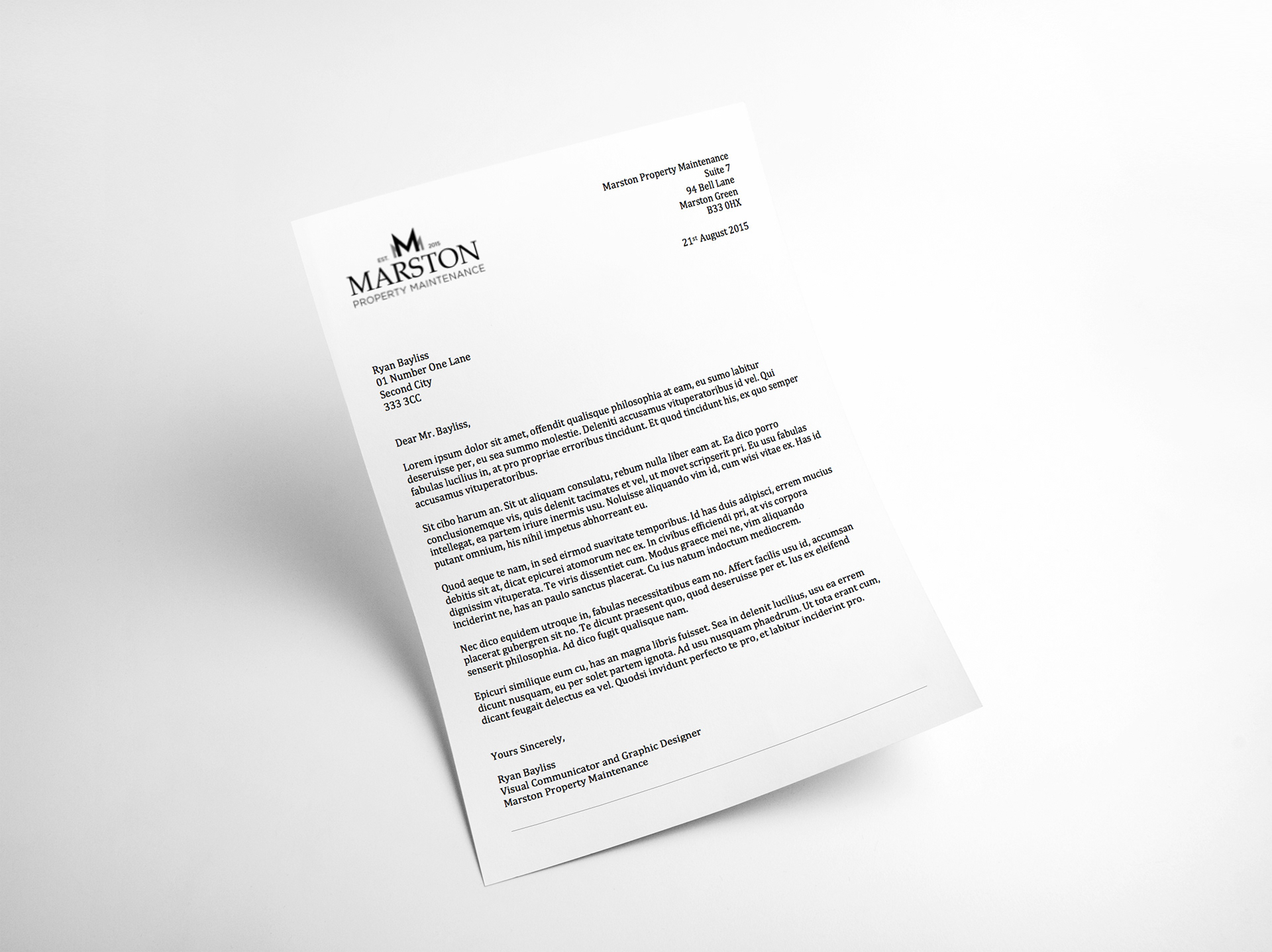
LETTERHEAD
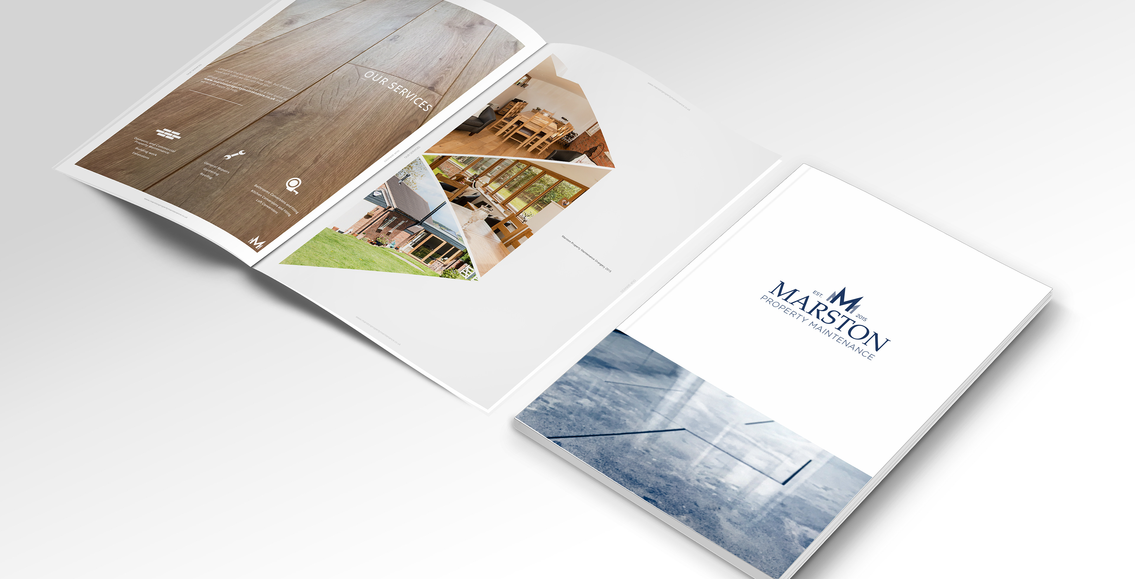
BROCHURE | HAND OUT
The brochure is a singular-page design to post to new customers after receiving their free quote. It's a personal reminder the company want to send out to approach their new customers in a friendly and professional manner. Most handouts aren't even looked at or given the time of day so having limited singular pages instantly alert the customer that the information is minimal. Thus, the design using sharp and clean images is to attract the eye and leave a lasting, informative impression to the customer. Each customer receives different versions (once images are updated) providing them with individual brochures relevant to their inquiry, giving insight to the potential work in hand.